
Understanding the Basics of Float

When it comes to web design, the concept of float is something you can’t afford to ignore. Float, in simple terms, is a CSS property that allows you to position elements on your webpage in a way that they can float to the left or right, making room for other content to wrap around them. This property is particularly useful for creating multi-column layouts and for aligning images and text side by side.
How Float Works
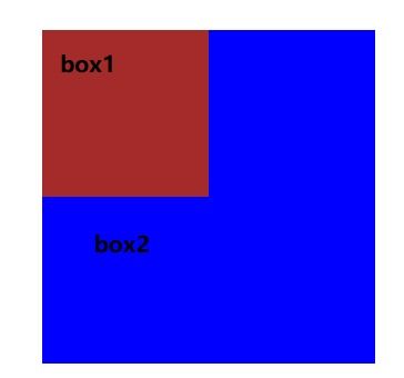
Float works by changing the display properties of an element. When you apply the float property to an element, it becomes a block-level element, but instead of taking up the full width of its container, it floats to the left or right. This means that other content can wrap around it, creating a more dynamic and flexible layout.
Here’s a basic example of how float works:
img { float: left; margin-right: 10px;}
In this example, the image will float to the left, and the text will wrap around it. The margin-right property adds space between the image and the text.
Clearing Floats

One of the challenges of using float is that it can affect the layout of other elements on the page. To prevent this, you need to clear the floats. There are several ways to do this, but one of the most common methods is to use a clearfix:
.clearfix::after { content: ""; display: table; clear: both;}
This CSS rule creates a pseudo-element that acts as a table, and then clears the floats by setting the clear property to both.
Float vs. Flexbox and Grid
While float is a powerful tool for creating layouts, it’s not the only option available. Flexbox and Grid are two modern layout techniques that offer more flexibility and control over your designs.
Flexbox is a one-dimensional layout system that allows you to align items in a row or column. It’s particularly useful for creating responsive layouts that adapt to different screen sizes.
Grid, on the other hand, is a two-dimensional layout system that allows you to create complex layouts with rows and columns. It’s a more powerful and flexible option than float, and it’s becoming increasingly popular among web designers.
When to Use Float
Despite the rise of Flexbox and Grid, float is still a valuable tool in your web design toolkit. Here are some situations where float might be the best choice:
- When you need to create a multi-column layout with a fixed width.
- When you want to align images and text side by side.
- When you’re working with older browsers that don’t support Flexbox or Grid.
Float and Accessibility
It’s important to note that float can affect the accessibility of your website. When elements are floated, they can be moved out of their natural reading order, which can make it difficult for screen readers to navigate the content. To ensure that your website is accessible, make sure that your floated elements are still in a logical reading order and that you’re using semantic HTML.
Float and SEO
Float can also impact the SEO of your website. When elements are floated, they can be moved out of their natural position on the page, which can affect the way search engines crawl and index your content. To ensure that your website is optimized for search engines, make sure that your floated elements are still in a logical order and that you’re using proper HTML tags.
Float and Performance
Float can also affect the performance of your website. When elements are floated, they can cause reflows and repaints, which can slow down the rendering of your page. To ensure that your website performs well, make sure that you’re using float judiciously and that you’re optimizing your CSS.
Float and Future-Proofing
Finally, it’s important to consider the future of float. As new layout techniques like Flexbox and Grid become more widely adopted, float may become less relevant. However, it’s still a valuable tool for web designers, and it’s likely to remain a part of the web design toolkit for the foreseeable future.
In conclusion, float is a powerful and versatile CSS property that can help you create dynamic and flexible layouts. However, it’s important to use float judiciously and to be aware of its potential impact on accessibility, SEO, and performance.


